Background
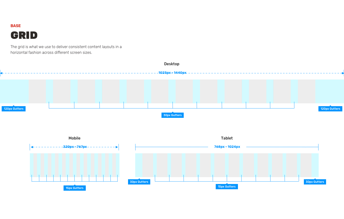
Current Design system is in disarray, has been handed off/on with different agencies, groups, departments.
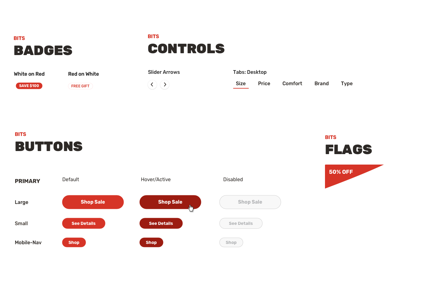
Matress Firm has been working with so many different starting points for the last few years that no one knows what button style is accurate. Is it the one with the 4px radius, no radius, or the black one, red one? No rules had been defined so I came on board to do just that.
Research
First step is to conduct an audit of everything so far. They had sketch files, Adobe XD files, pdfs and the start of a Figma project. Each items was slightly different than ther other depending on the department and agency that built the guide.
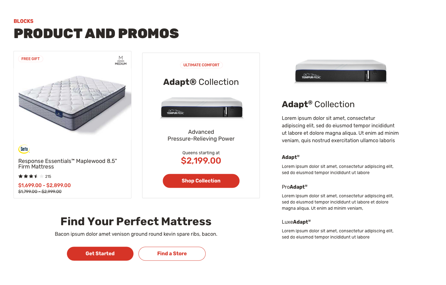
My work consisted of laying everything out on a table (virtually of course) using Miro to establish a baseline. All the button styles, all the different types of product cards and more. A document was created to track the effort and over the next few weeks I met daily with Matress Firm product people to review and make decisions.
The important considered during this audit included:
- Consistency among component styles
- Quality of the components
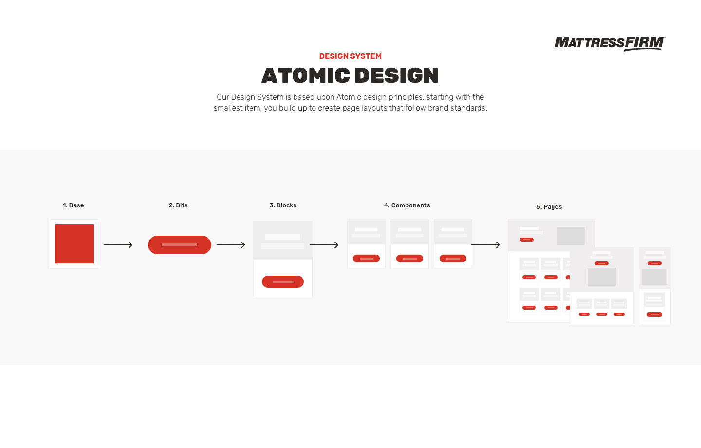
- Orgnization of the components at the atomic level
- Accessibility at a AA compliance standard
Who will be using or benefiting from this design system?
Directly
- UX (Design, Research)
- Dev (Tech, Infrastructure, Code)
- Product (PM, PO, BA)
- Content Producers (Strategy, Communications)
- Consumers (Users of the website)
In-directly
- Marketing (Email, Social)
- Creative (Brand, Graphics)
- Sales (CRM, Chat, Phone, Support)
The System
Key Learnings
Design systems can quickly become complex and hard to use if considertion is not given to the complexity of what is being created upfront by all parties involved.
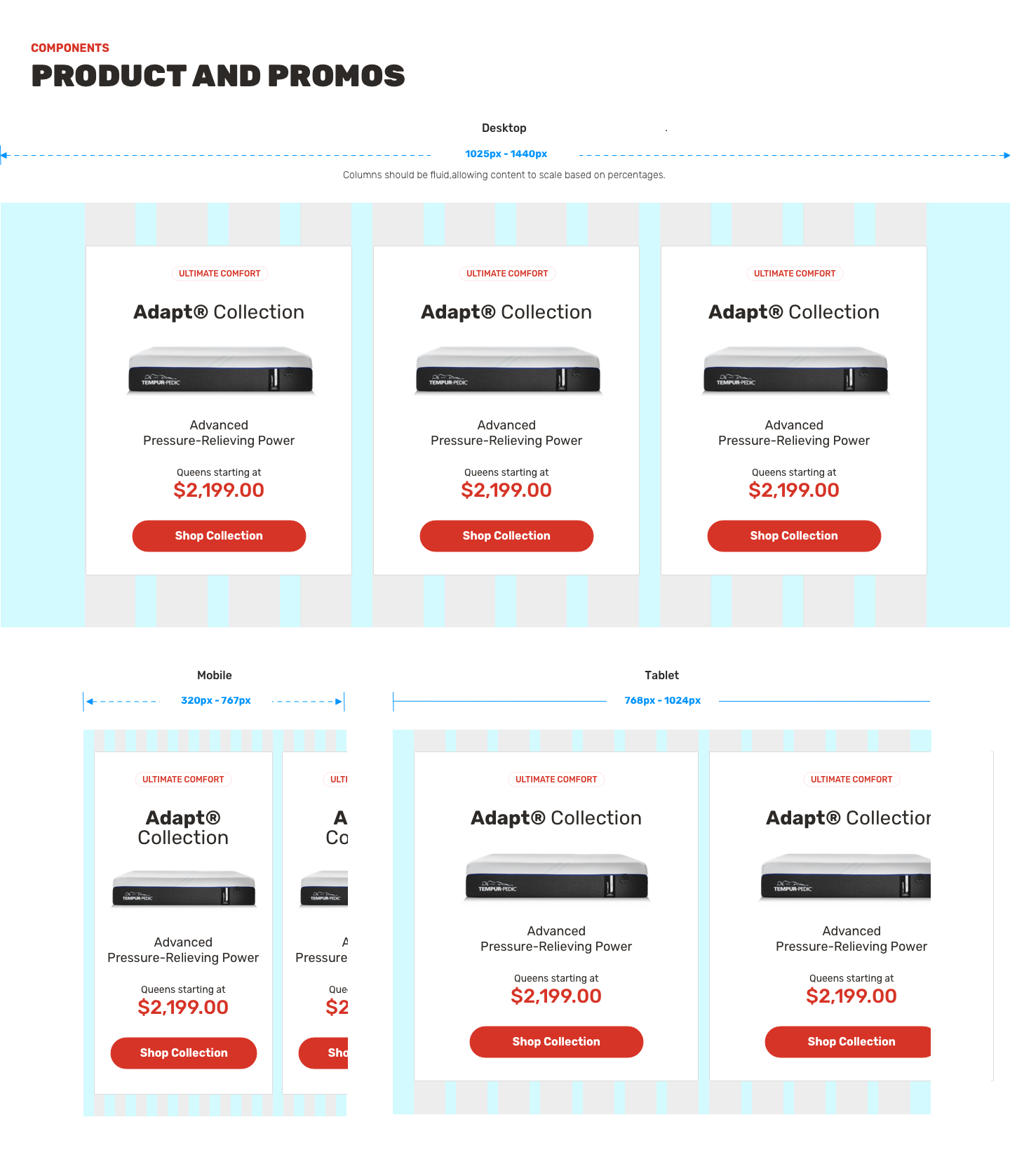
- Documentation on the design system, must be provided, to allow those not close to the original work to build an effective page. Without docuemtnation (the how) it is not a system, just a series of UI components (the what).
- Utilize the rule of patterns, it may seem that some pages are starting to look the same, but through testing users find comfort and trust when patterns are applied on certain types of pages.
